In-Context Photo

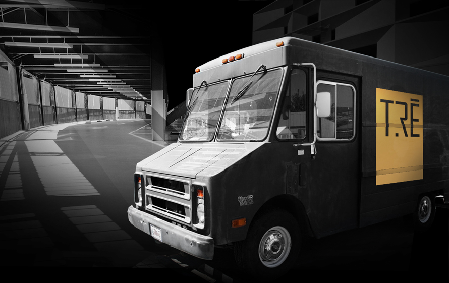
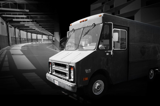
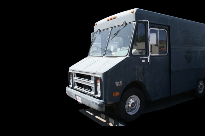
TreLogo_CreativeSession_Brandingtruck(Final Image)

Some of you may take my advice as common knowledge, but everyone else should make it their routine to generate in-context photos of their work as part of their process. CS RECOMMENDED!

I can't emphasize enough how important it is to use in-context images for your work. Whether a product design or graphic project, you've already spent "x" amount of time designing it; SPEND! that extra minute to render or Photoshop your awesome design into place. Your clients and viewers will appreciate the effort. Remember that a percentage of people are not DESIGNERS and will have trouble imagining how awesome your design looks in it's appropriate environment.

I just wrapped up a branding project for Tre Redeau and wanted to share a quick in-context process. One of the image I generated was the idea of a promotional vehicle for the client. Rather than a regular van I suggested the idea of a mobile concert station using a step van.

Concept: Since my overarching theme was black and gold, I imagined a photo of a black step van taken under some sort of street lamp at night or with a dark background, with Tre's logo on the side. My request was a bit too specific so I searched three different images that I can composite together.

A good site to find royalty free images is: www.compfight.com

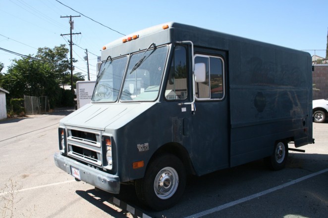
Step Van I used. Although this wasn't black its at the right angle and a dark hue:

stepvan_dark_creativesession

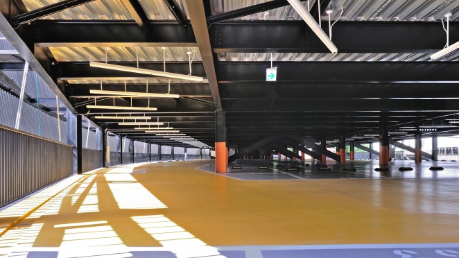
Of course the step vans background isn't very attractive, I wanted it to feel parked in a fancy parking structure.

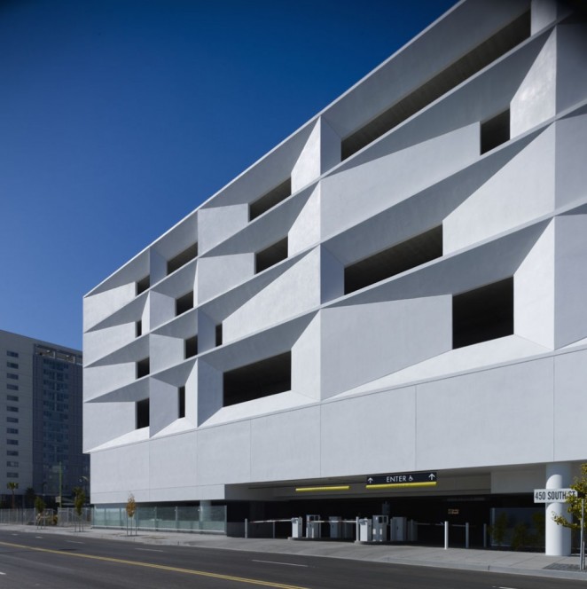
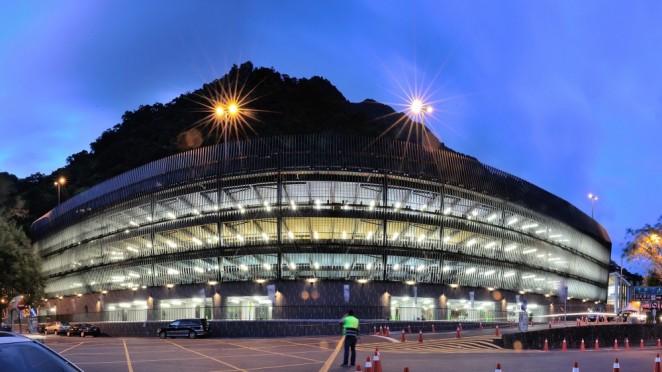
 So top two choices were the Wulai parking structure and the San Francisco Mission Bay parking structure. I used both. LOL

MissionBay_CreativeSessionPhotoshop

wulai_parkingstructure_CreativeSessionPHtotoshp photo courtesy of QLAB

wulai-parking-structure-qlab_h-g-_creativesession photo courtesy of QLAB

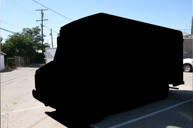
Firstly I blocked out the step van, blocking out the van in a dark color like black will let you revisit the shape when you need to. This way I can use the lasso tool if I ever need to go back and pick up the shape again.

Blocking_outVan_CreativeSession_treredeau

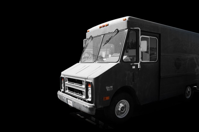
Isolating the van I kept a bit of the ground in the image because you can blend the ground later and it helps with perspective.

Isolate_outVan_CreativeSession_treredeau

I moved the van to where I needed it to be and desaturated the colors. This keeps it neutral to my black and gold theme. As you can see I blurred out the ground and added more darker shadows to the rear wheel-well.

Isolate2_outVan_CreativeSession_treredeau

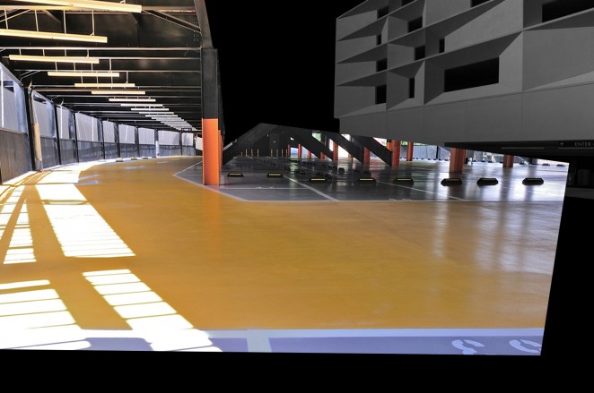
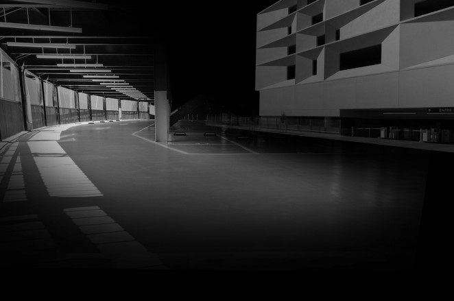
Next I added the Mission Bay lot faded into the background and skewed the Wulai parking structure to match the step van's perspective. I also trimmed out the roof.

missionbay_CreativeSession_treredeau

Erased, desaturated the colors because they're too dominating. The background shouldn't be our focus.

missionbay_desaturate_CreativeSession_treredeau

Brought back the van and added reflections on the window, moon/sun light leakage coming from the left:

VanBackinLightleakage_outVan_CreativeSession_treredeau

Lastly the logo and we're done.
TreLogo_CreativeSession_Brandingtruck

Bentley Food Scouting Dog

On our usual early morning walk this AM Bentley totally went off on a tangent. My bad for checking my email while Bentley veered left to sniff a bush, I thought the usual, he's probably sniff out odd scents. Next thing you know he's walking down the road with a tortilla in his mouth. Adorable but it amazes me how amazing dogs sense of smell can be, I took a photo of the bush on our way back home since Bentley was fighting hard to come back to the same bush. haha

Fast Company Publicity

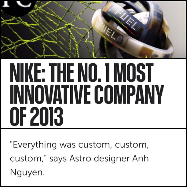
Congratulations to Anh Nguyen on being quoted in Fast Companies write up about NIKE being the number one most innovative company of 2013. Creative Session_AnhNguyen_AstroSTudios_FastCompany_Feature

UPDATE: Lighter Koozie

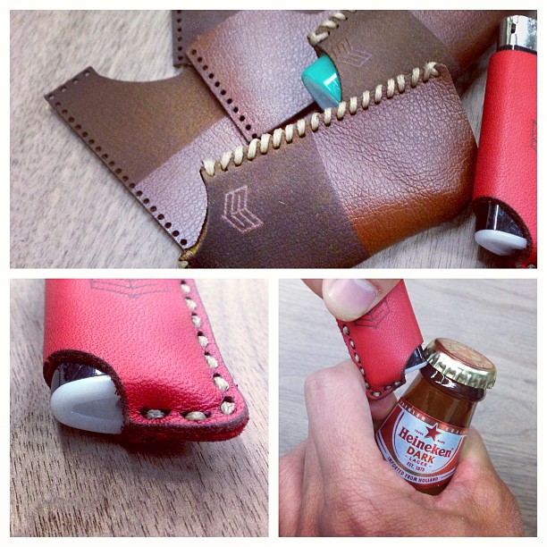
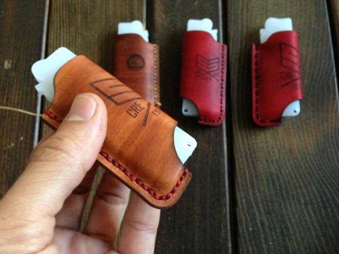
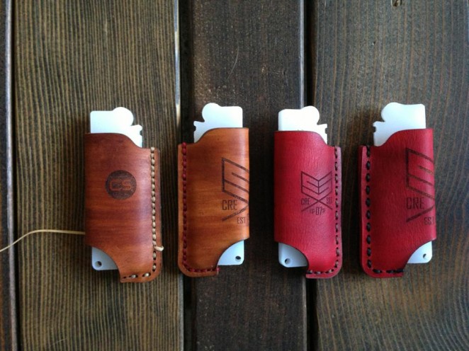
LighterKoozie Concept UPDATE:

We're working on filming a short video of the process of making this lighter koozie. Instead of writing an excerpt on this I think you will enjoy the video. Enjoy the photos for now.
creativesession_lighter_koozie2 creativesession_lighter_koozie13


ATTENTION ID and Graphic Designers

ATTENTION: All my Industrial Designers and Graphic heads. One of our followers, Melissa Little is an independent recruiter working with several design and branding agencies in San Francisco. She is looking for Industrial Designers at all levels as well as Graphic Designers and Digital Creatives. One very hot, dream-type role for a 7-10+ years Director level who can both design high profile products and manage people is looking right away and will relocate. Please contact her directly at

melissa@littlemoreconsulting.co

Twelve Flavors

All you designers know the feeling when you wrap up a project and ready for the next one, well we just wrapped up a branding project with TwelveFlavors. Just a few more tweaks and the final packet goes out today. Here are a few icons that got us excited through the design process.


lead from within

"TO SHARE YOUR WEAKNESS IS TO MAKE YOURSELF VULNERABLE; TO MAKE YOURSELF VULNERABLE IS TO SHOW YOUR STRENGTH"

THNX DIANA! ;)

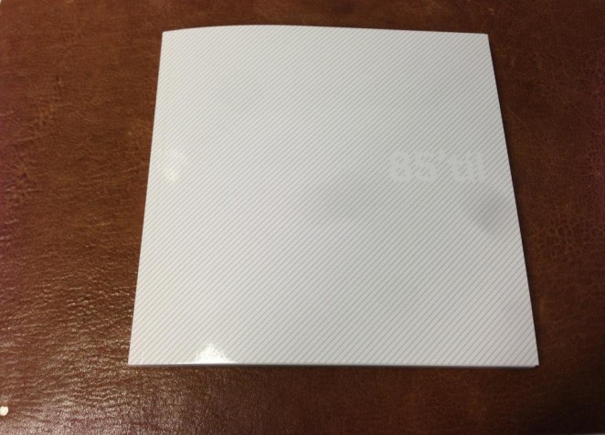
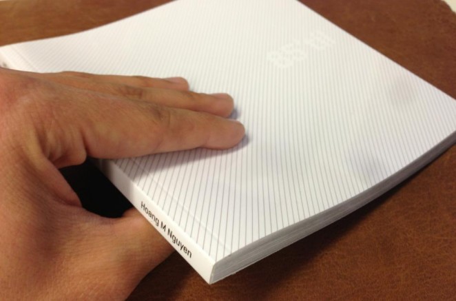
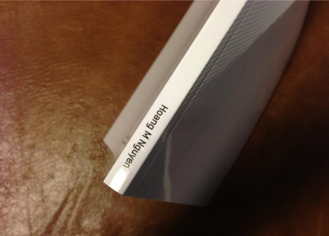
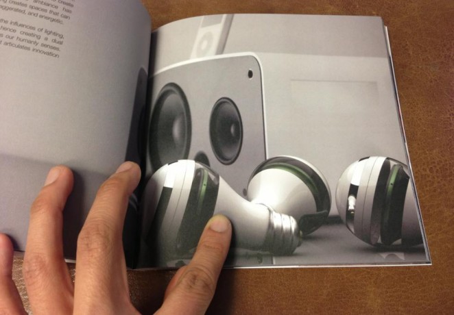
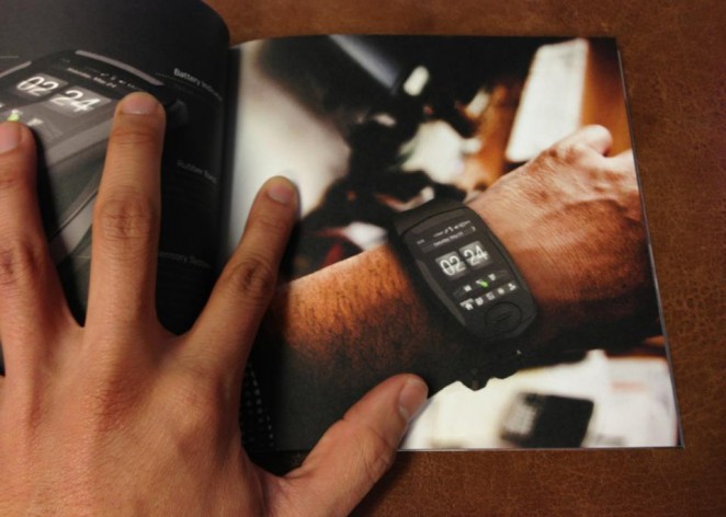
85til' The lessons i've learned. Applied.

This book is dedicated to our mama and papa mostly. Also all of the wonderful people whom have inspired me along the way. My design career has transcended from lessons learned thus far. I'm excited for the years to come. - Hoang  

Camo Mary Poppin's

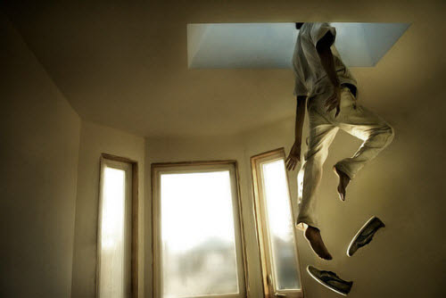
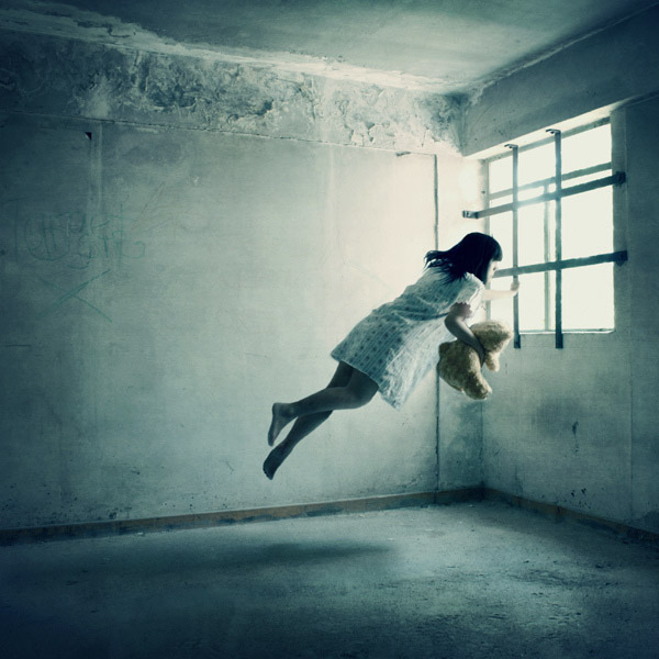
While shooting for Jasper and Peg this weekend. I thought how fun would it be to try "Levetation Photography" My photo isn't quite succesful but check out these awesome ones. These shots are so elegant, these subjects look so feather weight.


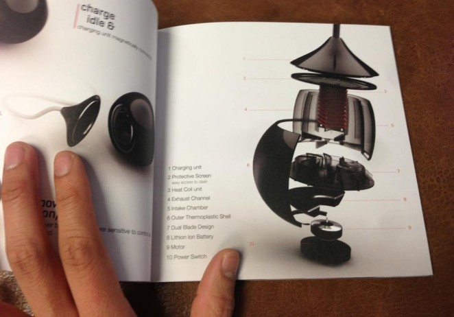
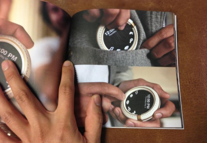
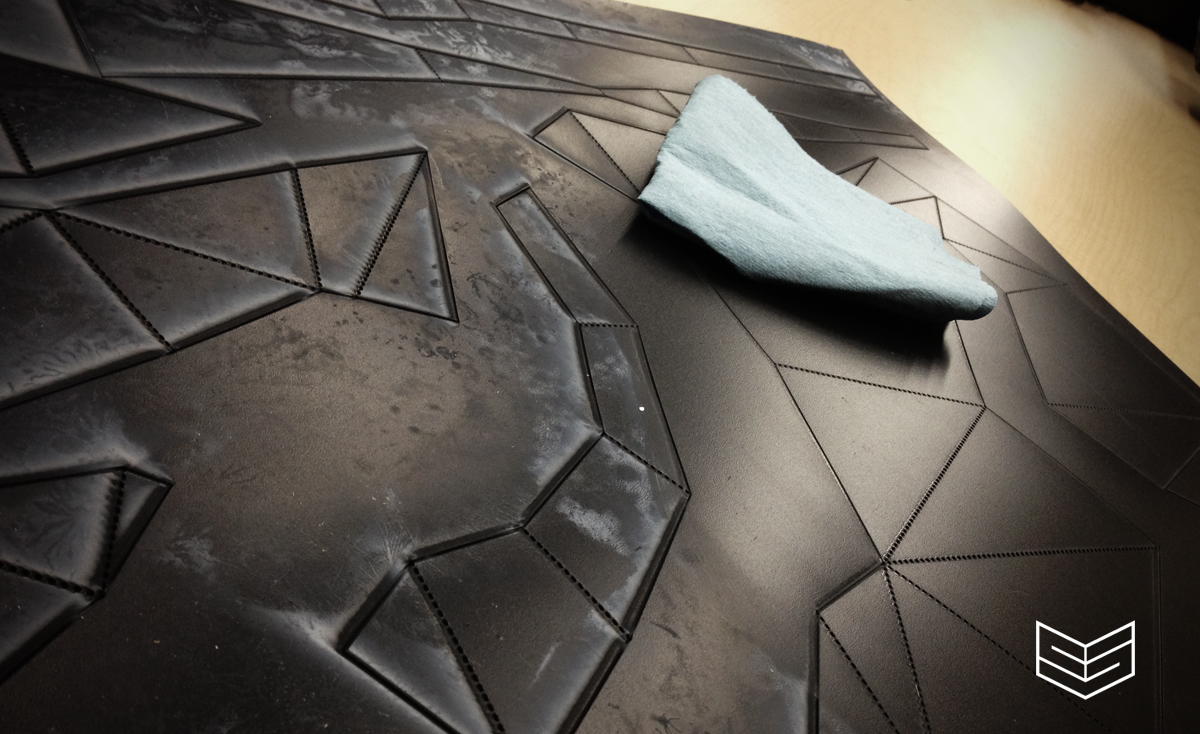
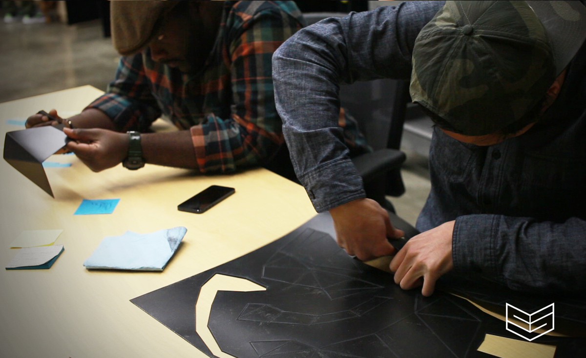
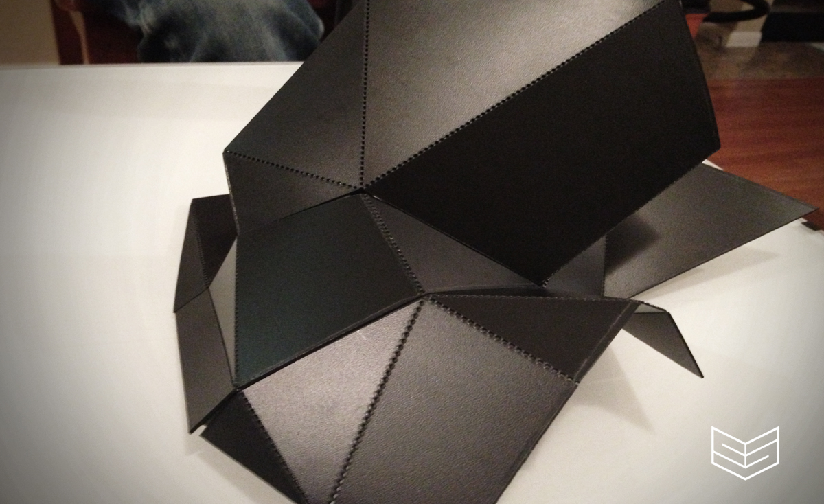
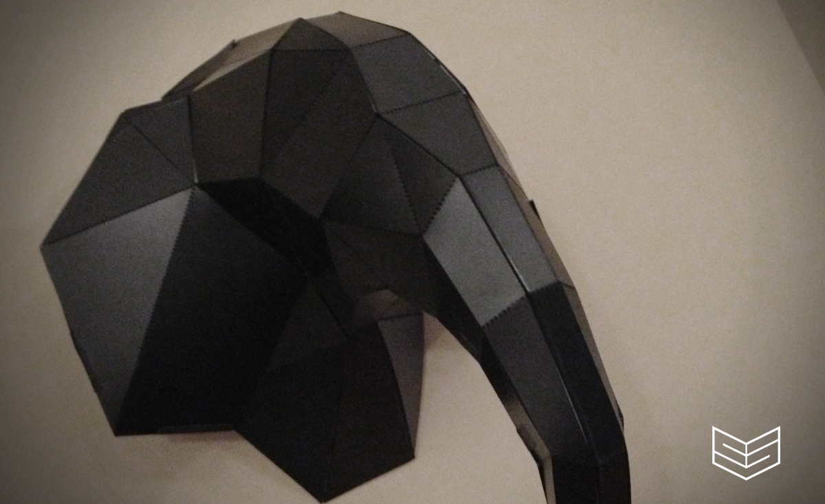
HED LYTE: Round One Prototype

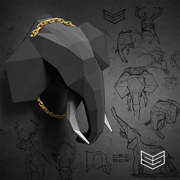
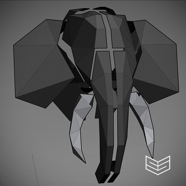
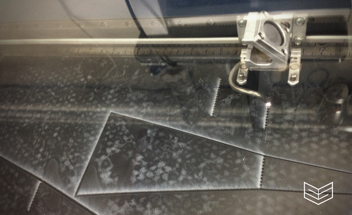
Quite a few people have been asking about "HED Lyte" so I'll start posting process photos here! This is the transition from digital to physical, so the model may appear a bit rough. As we continue to sample materials and build more models it'll start to look better! You guys definitely have to see this in person! Pretty unreal!

hedlyte creativesession design elephant

hedlyte creativesession design elephant

hedlyte creativesession design elephant

hedlyte creativesession design elephant

hedlyte creativesession design elephant

hedlyte creativesession design elephant

hedlyte creativesession design elephant

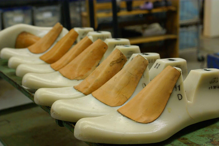
Shoe Molds?

This goes out to all you shoe gurus. What are these called, I mean the technical term for these. I did a simple search for "Shoe Mold" I feel like there is an industry term for them and I've probably heard it before. We're looking for a unit for the office to design some shoes.


LAMPFIRE

The fire is the main comfort of the camp, whether in summer or winter, and is about as ample at one season as at another.  It is as well for cheerfulness as for warmth and dryness.  ~Henry David Thoreau

It used to be each summer a group of friends and I schedule a summer camping trip at the Oregon Coast, generally this lands mid to late August while summer is at it's best. If you're an Oregonian you know we are dark, cloudy and rainy about 85% of the year so we take advantage of the good weather when the opportunity is there.


Now the complications of growing up are that people move away, we become busier, we start families, our schedules and lives are based around timely factors.


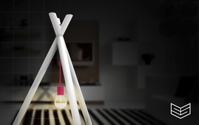
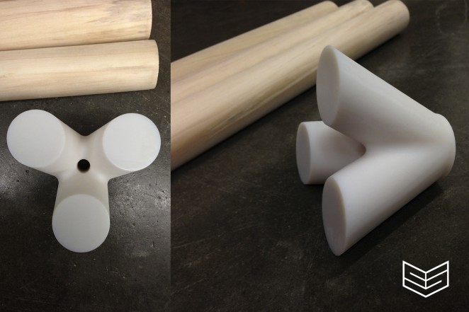
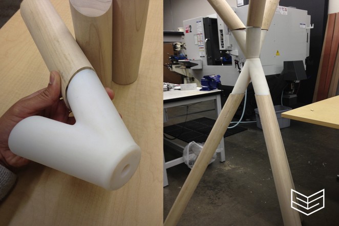
Driving to work one morning two miles of my commute is graced with vast plains of grass and greenery. With my window down the crisp air brought back nostalgic memories of my used to be yearly camping trip. Late evenings around a campfire; yelling, joking, eating, telling stories, pure joy, fear, excitement ... insert emotions. This is natures invitation to bond, to come together, to surround ourselves with loved ones and get lost. At this very moment these memories converted into a design, a design with meaning, something to capture the essence of a campfire.


This is the "LampFire"


Check out our full process album via FACEBOOK