


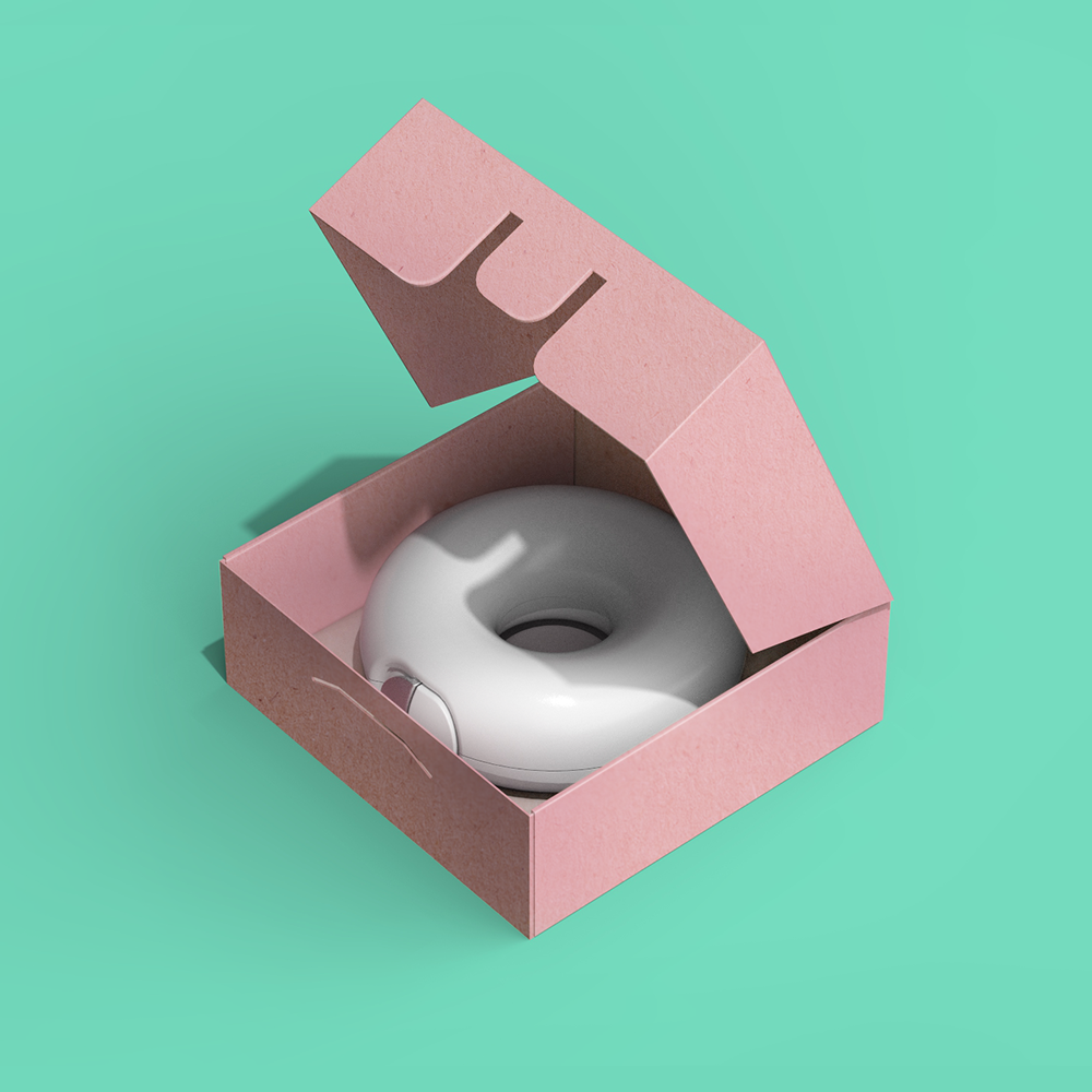
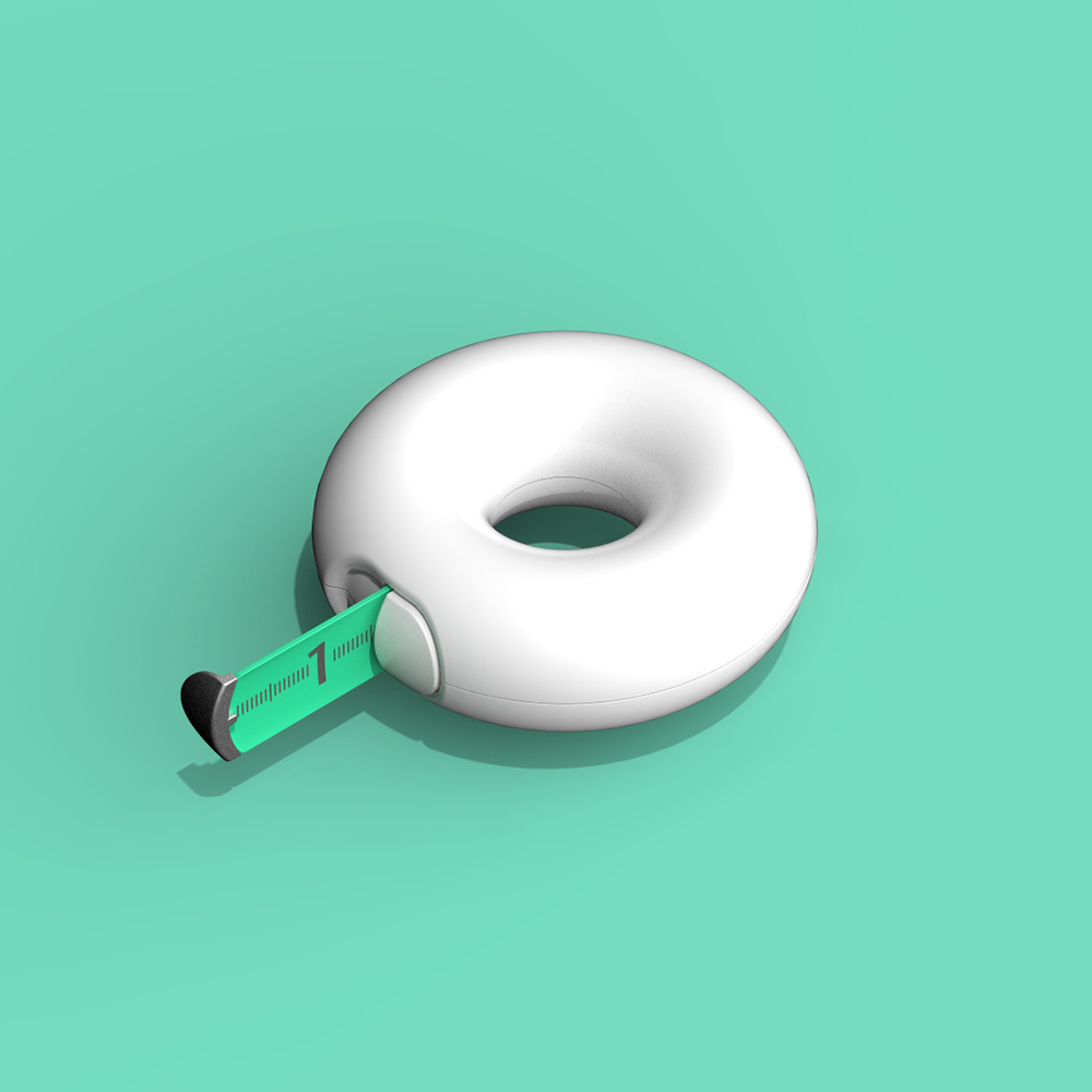
Design Challenge No.4
In light of National Donut Day we're challenging the design community to design anything your heart desire. The only requirement is you have to use the donut (torus) shape as baseline, anything else goes. You can even use more than one tori. Have fun and don't forget to tag #DoingDonutsWithCS


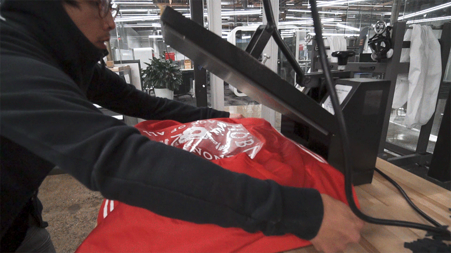
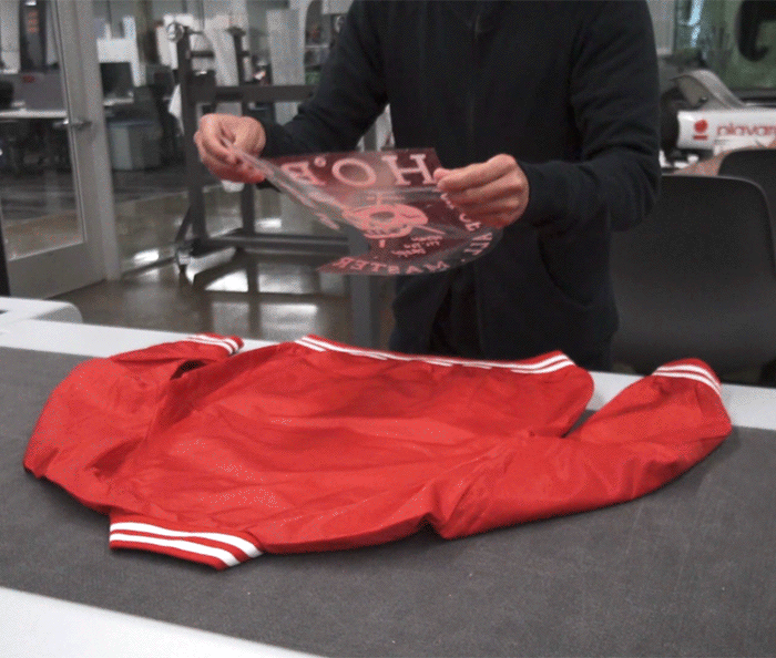
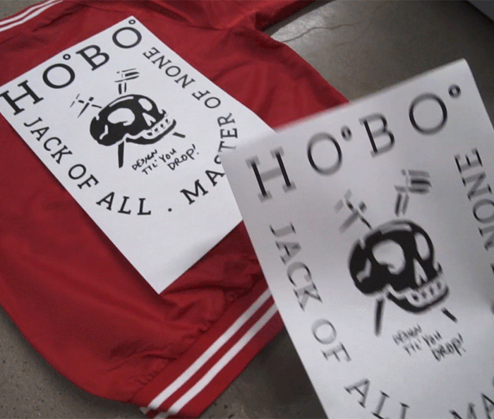
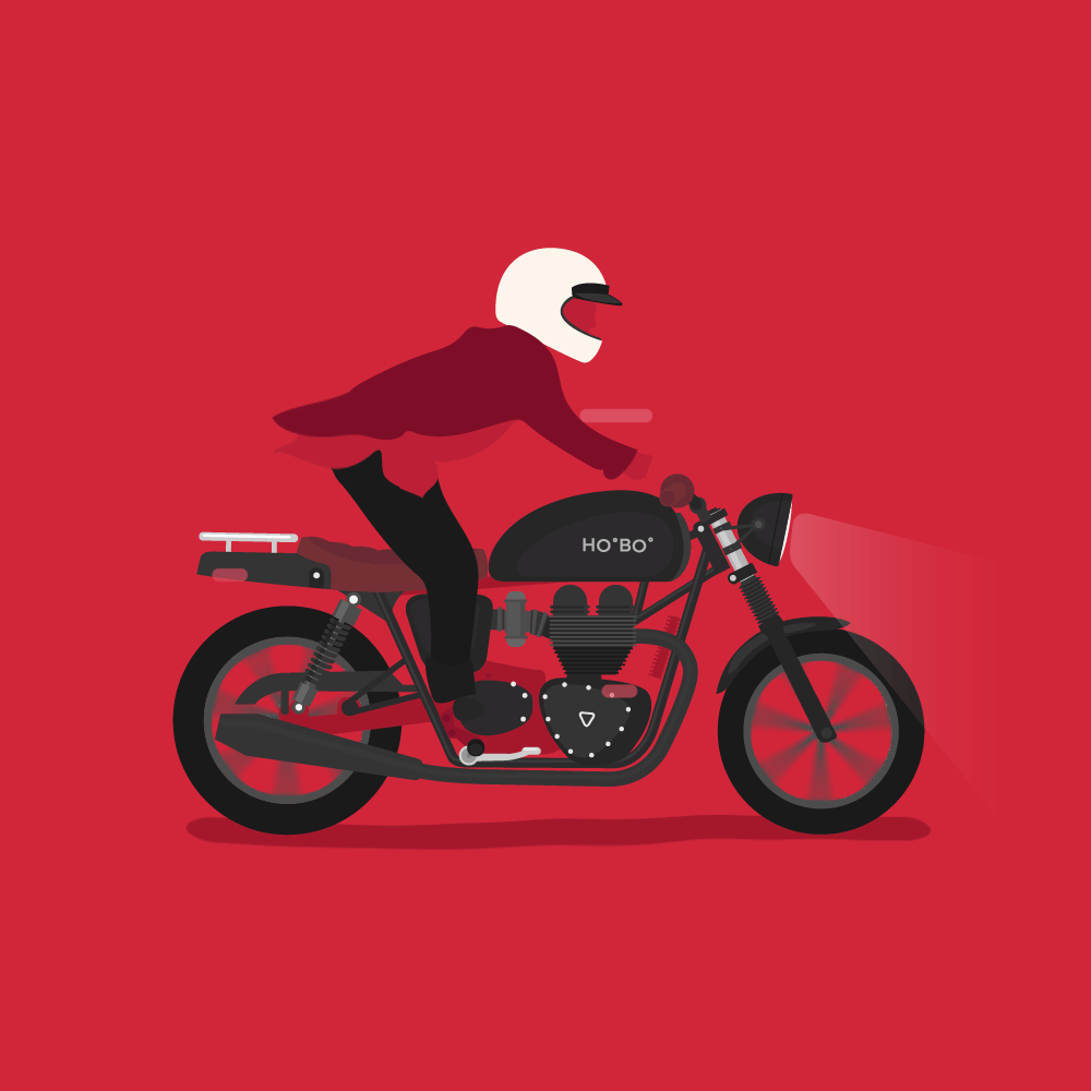
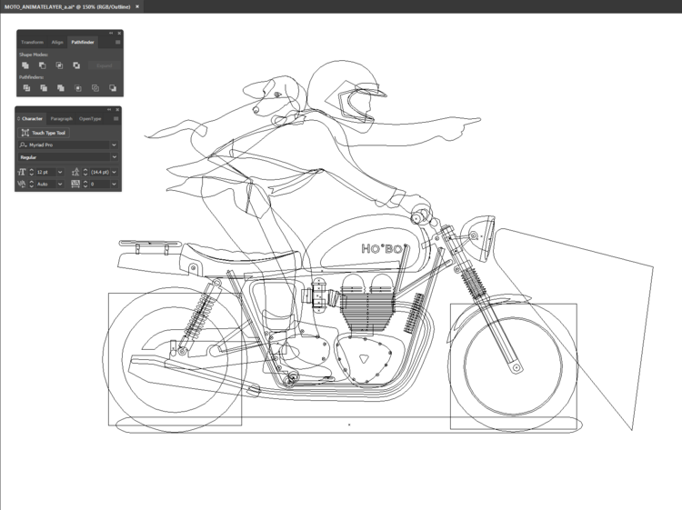
GIF FOR HOBO
Something I made for a personal blog called HoBo : www.hobo.life


MUSE work in progress


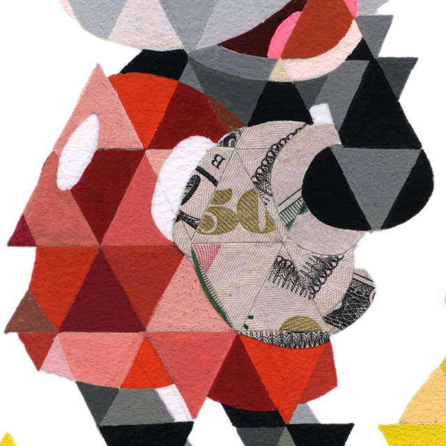
Fuck You, Pay Me
Our latest pick up is this print "Fuck You Pay Me" by Joseph Martinez. He started working on this in 2012 using mixed mediums of gouache and currency. Joseph says "The way our economy is going, and still is for that matter, even Mickey Mouse is collecting his dues." You can check out Joseph's interview with 1xRun here.
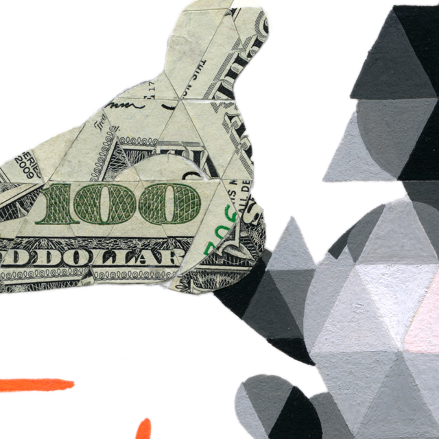
For me what's captivating about this piece is the play with money. We've all seen Mickey in this particular pose before. It is one of the most iconic images from Disney. What's interesting is Mickey's raised right hand has never meant anything other than a welcoming gesture to me. It's crazy, simply replacing the white gloves with money, this grand gesture immediately looks more like begging hands. Now I'm not sure if that was the intent the artist had, but it's @#!&ing effective on so many levels. Especially when it's titled "Fuck You, Pay Me" Anyway. I'm that guy who believes there are undertones of Illuminati activity in everything. Conspiracy theories all over (paranoid right). Thus you see why I might be reading into this way too much, or its just the critical artist in me.
What I'd really like to point out is my initial reaction. The value here is knowing we're all worth a pretty penny and often we sell our selves short. Do not take your skills for-granted. At its simplest, this print is a visual reminder that time is money and how much is your time worth?
Reminds me of this quote I ran across weeks ago.
"If you think it's expensive to hire a professional to do the job, wait until you hire an amateur. " --Red Adair
WOOF
Woof is an up and coming pet company out of San Francisco that is focusing on sustainable dog products. I think they'll be the Proctor & Gamble in the dog market. WATCH OUT WORLD. Here is a small collection of identity work we've done for Woof. These logos are the results from our investigation of Woofs initial "W" check out the quick process video below.
![]()
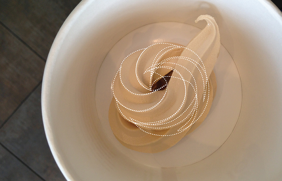
YOGURT OF A TIME
Here is a bit of our mind, our process.. Late June this summer, I miserably spent my time after work dispensing swirls at Yogurtland. This wasn’t an attempt at a diet or some kind of yogurt fasting. I was on a mission to produce the perfect swirl for a branding project.
Up until then, I’ve been cranking out logo marks, digitally translating sketches, and packaging a kit for our client “Tangerine” a yogurt & burger joint out EAST. Between bro and I, we were quite happy and confident with what we had to deliver except one particular logo, the tangerineswirl concept.

In theory this concept was clever but the execution just didn’t feel right to me. The idea was to extract design ques from both the tangerine and a cup of yogurt. Combining the two, I illustrated a birds eye view of a cup of yogurt. I retained it’s organic curves and bounding it to the elliptical shape of a tangerine. I kept the citrus-y orange hues for the body of the logo as it transgresses into the refreshing green portion of the leaf. Beautifully pictured in my mind, the first execution really lacked substance. Hence, my serial yogurt shop visits.

I think the biggest challenge was eating the yogurt after all the failed attempts. We had fun distracting the employees none the less.

Finally dispensing something I could actually work with, I drafted these images to help guide the client's vision.


What I loved most about this project was being able to disconnect myself from the computer and becoming more hands on and experimental. In today’s design world, our resources are of abundance. We often forget to go out, take a breather, and have fun.
(note: I didn't fully keep all the lines traced from the photo. With final refined version I cleaned up the transitions and overlapping shapes. I also made the overall logo more round. )
Enjoy

VAPECITY PROCESS
Before I publish VapeCity’s final design packet into our WORK section, here’s a bit of background on one of the many concepts we explored. The six sided VAPECITY logo. Vaporizer tycoon, Ken A, reached out to the brothers to design a one of a kind logo for his up and coming Vape shop. Like all graphic design inquiries, Ken wanted something recognizable yet different to his competitors. What we pitched to Ken wasn’t just a unique logo, instead, we pitched a lifestyle and an experience.
With research we found other shops lacked goals. Their mission statements had little or no substance. For Ken’s Vape shop, we championed the idea of positioning himself in a more health conscious niche. Marketing to the “I AM QUITTING” and “HEALTH CONSCIOUS” demographics. The lifestyle should be about vaping to ease off smoking and eventually quitting.
Thus, coining the term “BREATH” as their campaign slogan. Breath free, breath healthy, breath better.

Understanding that vape oils come in levels of 24, 18, 12, 6 & 0 milligrams of nicotine, we wonder if a 6-step vaping program could be designed to lower a smoker’s nicotine craving and intake? We wanted to take Vapers on an experience that would result with an incentive to not only buy a Vape, but also to change their lives for the better and quit smoking.

Proposed steps:
Step 1: Cigarette Smoker -- Step 2: Vape Nicotine 24g -- Step 3: Vape Nicotine 18mg -- Step 4: Vape Nicotine 12mg -- Step 5: Vape Nicotine 6mg -- Step 6: Vape Nicotine 0mg


Particle Play
I've been toying around with this plug-in called Pluxus 2. I must admit before learning about plexus I was animating particles per dot. What a bummer that I didn't find out about this sooner. Anyway hoping to be good enough to apply to it in an upcoming project.here is a sample video:
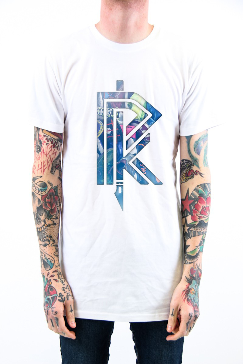
Rock Paper Kick
I'm attaching some quick screen captures of a custom shirt for Rock Paper Kicks. What you're looking at here is the final logo chosen by RPK masking sneakers. Look out for the full posting under our PORTFOLIO section. Enjoy for now.

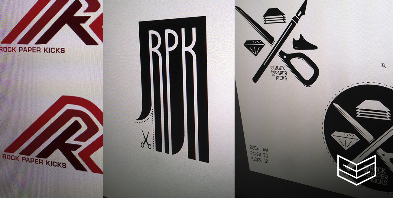
Rock Paper Kicks
So if you have been keeping up with our blog you'll have noticed an excerpt, on Jennifer the talented PaperSmith, that I posted about a week ago. Well we've been working on branding for her company called "Rock Paper Kicks", I managed to spend a bit of time this past weekend sketching out various ideas. Here's a rough glimpse into my sketchbook and illustrator work. I personally love the earlier stages of my design process because I get to design-vomit all over the place before we dial in the details.

In-Context Photo
 (Final Image)
Some of you may take my advice as common knowledge, but everyone else should make it their routine to generate in-context photos of their work as part of their process. CS RECOMMENDED!
I can't emphasize enough how important it is to use in-context images for your work. Whether a product design or graphic project, you've already spent "x" amount of time designing it; SPEND! that extra minute to render or Photoshop your awesome design into place. Your clients and viewers will appreciate the effort. Remember that a percentage of people are not DESIGNERS and will have trouble imagining how awesome your design looks in it's appropriate environment.
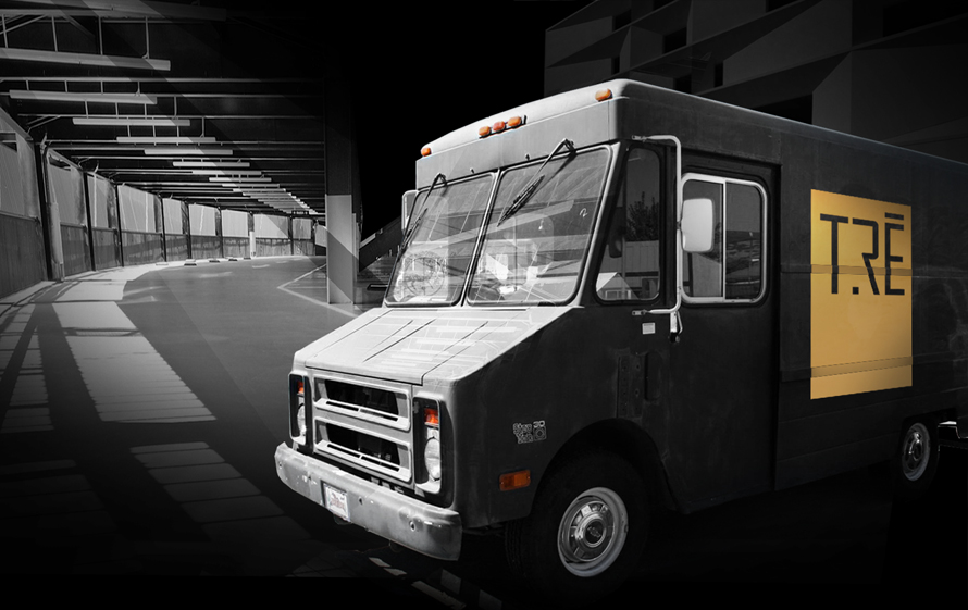
I just wrapped up a branding project for Tre Redeau and wanted to share a quick in-context process. One of the image I generated was the idea of a promotional vehicle for the client. Rather than a regular van I suggested the idea of a mobile concert station using a step van.
Concept: Since my overarching theme was black and gold, I imagined a photo of a black step van taken under some sort of street lamp at night or with a dark background, with Tre's logo on the side. My request was a bit too specific so I searched three different images that I can composite together.
A good site to find royalty free images is: www.compfight.com
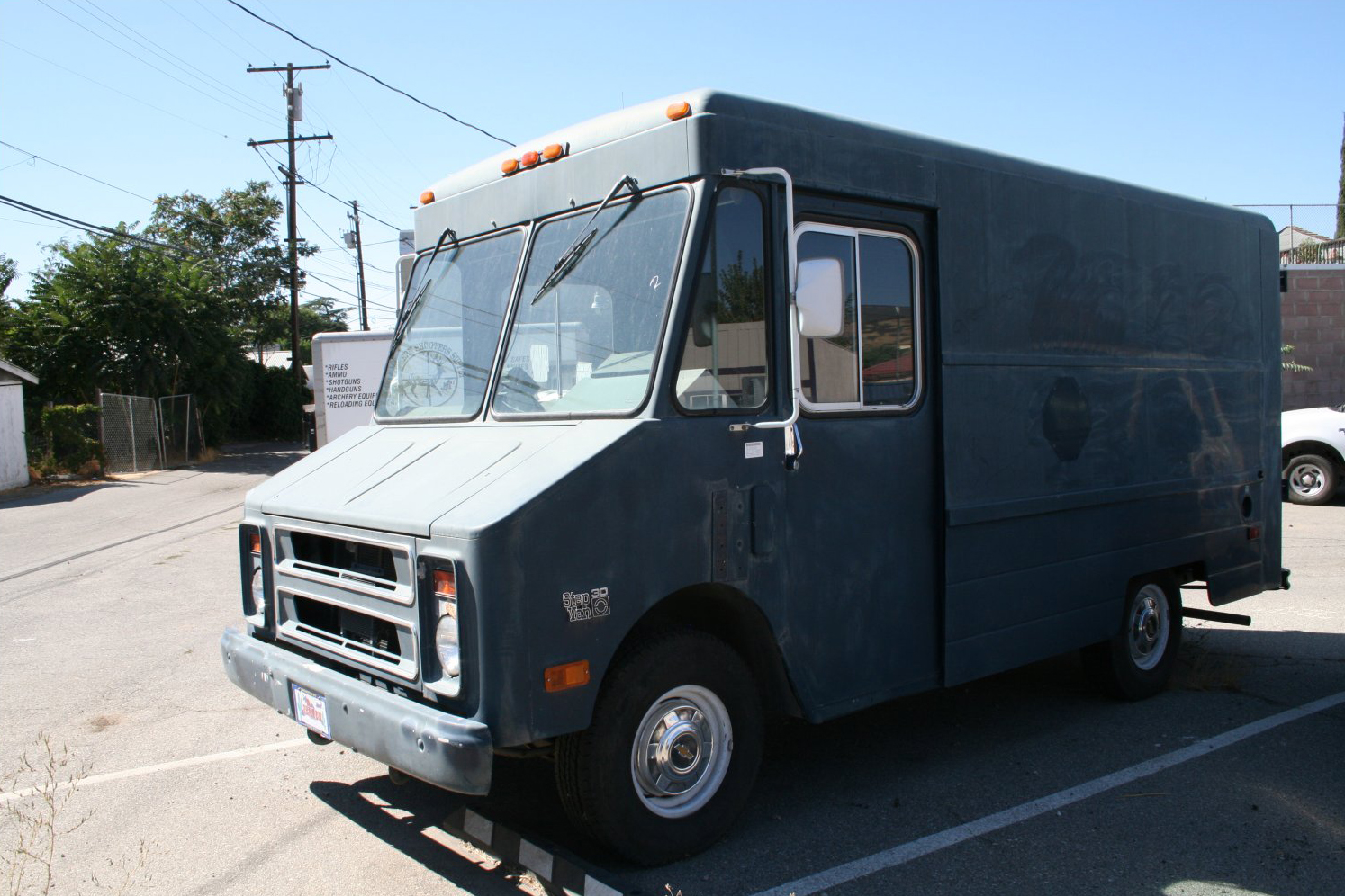
Step Van I used. Although this wasn't black its at the right angle and a dark hue:
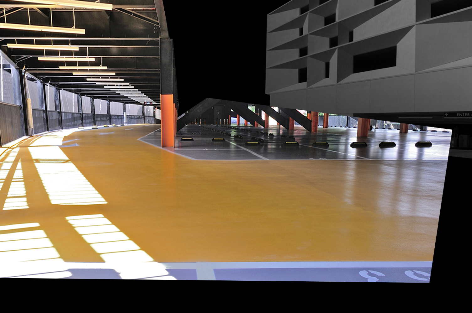
Of course the step vans background isn't very attractive, I wanted it to feel parked in a fancy parking structure.
So top two choices were the Wulai parking structure and the San Francisco Mission Bay parking structure. I used both. LOL

 photo courtesy of QLAB
 photo courtesy of QLAB
Firstly I blocked out the step van, blocking out the van in a dark color like black will let you revisit the shape when you need to. This way I can use the lasso tool if I ever need to go back and pick up the shape again.
Isolating the van I kept a bit of the ground in the image because you can blend the ground later and it helps with perspective.

I moved the van to where I needed it to be and desaturated the colors. This keeps it neutral to my black and gold theme. As you can see I blurred out the ground and added more darker shadows to the rear wheel-well.

Next I added the Mission Bay lot faded into the background and skewed the Wulai parking structure to match the step van's perspective. I also trimmed out the roof.
Erased, desaturated the colors because they're too dominating. The background shouldn't be our focus.

Brought back the van and added reflections on the window, moon/sun light leakage coming from the left:

Lastly the logo and we're done.
Tre Redeau Intro
So I've been working with Portland based rapper Tre Redeau commonly known as Blazé for sometime now. Tre wanted an intro for his music videos but also a clean easy to read logo. I finally finished the animation last night and am excited to show it to him. Check out the short 12 second clip.
Twelve Flavors
All you designers know the feeling when you wrap up a project and ready for the next one, well we just wrapped up a branding project with TwelveFlavors. Just a few more tweaks and the final packet goes out today. Here are a few icons that got us excited through the design process.

Logo's we've done thus far

102 Production Intro Video
Creative Session | 102 Production Intro Reel from Creative Session on Vimeo.
A few weeks back I started a logo project for a company called "102" they're a production company based out of Portland, Oregon. Here is the chosen logo along with an intro clip that will be used at the beginning of their videos. Enjoy.
I'll be posting our process soon
CS Dreamcatching
 I've been sitting on the idea of designing a dream catcher out of our company logo. To me it was a cool idea because the aesthetics of our logo lends itself to the intricate weaving details of a dream catcher.
I was inspired to design this way back when I saw the "TED talk" of Elizabeth Gillbert speaking about her book "Eat, Pray, Love" and the ways she stays inspired. The TED talk left an lasting impression when Elizabeth told the story of Ruth Stone. When an idea comes to Ruth she would feel or hear it coming, she then immediately would run like hell to catch the idea into some notes. Other times the idea would barrel through her and continue in the landscape looking for another creative. I'm sure we all have experienced this phenomenon once or twice in our lives, and idea comes to us and we do nothing about it and the next thing we know someone out there has executed it.
The CS Dreamcatcher is a graphic tribute for us to constantly hold onto our dreams and ideas. To be diligent and effective, to execute accordingly and never push or ignore our genius aside.
here is the video:
Air Max Typhoon
Been working on this illustration as a contributing piece for the gallery show at Astro Studios. See the progress its a typhoon of Nike's


CS INTRO CLIP
I've been meaning to make sometime to design a 10 second branding video that we can use at the beginning of all our videos. Finally sat down and sketched a really simple idea. The concept is to capture our passion for sketching and how sketching can lead to design opportunity, hence the ding sound effect at the end. Let me know what you guys think.
Starting the Oregon sweaters
Finally made a little time between all the regular work I had to swing by Keith studio in Oakland to start designing the final Oregon graphics for us to make the screen. We are well on our way in getting the Oregon sweaters for this winter season. Stay tune.
