

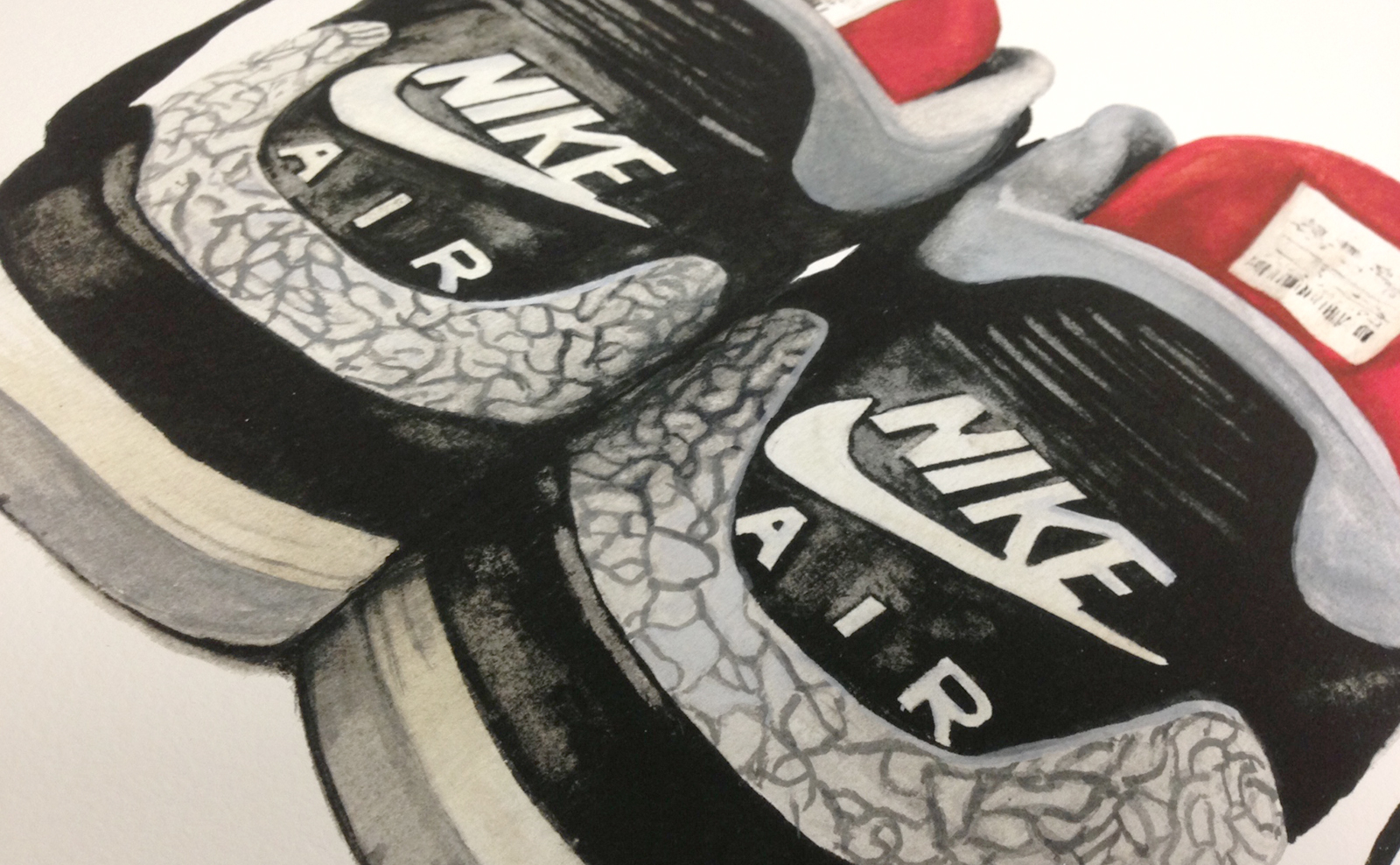
BAKER'S SON
We've been working with Keith Magruder on all kinds of projects since CCA days and have been following "Baker's Son" and his success. Keith has been travelling nonstop between LA and the Bay Area as of late for his shows and now working for Tom's (shoe) as a private artist. Between our busy schedules, we both made time to catch up last weekend and knocked out a process video of him painting. He's currently working on a collection called "Sweet Memories" using mainly watercolor as a medium.
Here is the video:
Keith also produces music. This track used in this video was an original by him. Check out his Baker's Son Soundcloud.
In his own words:
"Growing up, I remember helping my mom and grandmother in the kitchen as they baked cakes and pies. No matter what the occasion, even if it were a funeral, their work brought joy to people. I wanted to bring that experience into this setting. Our world is filled with so much destruction and chaos that sometimes we forget the simple sweet memories from our everyday lives."
And sneak peeks of the other paintings in the collection.


SOME MORE VOODOO BLACK MAGIC
Here is a snippet of a project we've got going on. This project should be ready for show & tell in about a week n' half. All shot on the Blackmagic Pocket in Raw with a 20mm 1.7 -- Color corrected in Davinci Resolve and edited with A.Premiere
T431 PROCESS VIDEO
We quickly shot this footage to share on instagram. Most of you whom seen this probably seen the crop and shorter version. Here is the wide screen and full length.
WOOF
Woof is an up and coming pet company out of San Francisco that is focusing on sustainable dog products. I think they'll be the Proctor & Gamble in the dog market. WATCH OUT WORLD. Here is a small collection of identity work we've done for Woof. These logos are the results from our investigation of Woofs initial "W" check out the quick process video below.
![]()
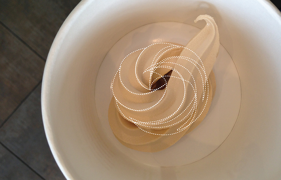
YOGURT OF A TIME
Here is a bit of our mind, our process.. Late June this summer, I miserably spent my time after work dispensing swirls at Yogurtland. This wasn’t an attempt at a diet or some kind of yogurt fasting. I was on a mission to produce the perfect swirl for a branding project.
Up until then, I’ve been cranking out logo marks, digitally translating sketches, and packaging a kit for our client “Tangerine” a yogurt & burger joint out EAST. Between bro and I, we were quite happy and confident with what we had to deliver except one particular logo, the tangerineswirl concept.

In theory this concept was clever but the execution just didn’t feel right to me. The idea was to extract design ques from both the tangerine and a cup of yogurt. Combining the two, I illustrated a birds eye view of a cup of yogurt. I retained it’s organic curves and bounding it to the elliptical shape of a tangerine. I kept the citrus-y orange hues for the body of the logo as it transgresses into the refreshing green portion of the leaf. Beautifully pictured in my mind, the first execution really lacked substance. Hence, my serial yogurt shop visits.

I think the biggest challenge was eating the yogurt after all the failed attempts. We had fun distracting the employees none the less.

Finally dispensing something I could actually work with, I drafted these images to help guide the client's vision.


What I loved most about this project was being able to disconnect myself from the computer and becoming more hands on and experimental. In today’s design world, our resources are of abundance. We often forget to go out, take a breather, and have fun.
(note: I didn't fully keep all the lines traced from the photo. With final refined version I cleaned up the transitions and overlapping shapes. I also made the overall logo more round. )
Enjoy
