Shocker lifestyle

"At the touch of love everyone becomes a poet."  -- Plato

Passion, inspiration, & ambition are attributes that drive us in doing the things we love. Unconditional effort to achieve more, to want more; is my main vehicle moving forward in life.

In light of National Breast Cancer Awareness month we're showing love with a design that literally spells out "Love", and what better way to spell it than some caring hand gestures.


Last week on a ride home I thought of my friend Dennis Truong's brand Shocker Lifestyle. His brand lends itself to really interesting graphic hand gestures. The best part is- for both of us, the common goal is success. Our tickets are booked, we're traveling at a different pace, but our journey will come with many blessings.  We're all creating our own movements in hope that our ripples turn into waves.  It's all because of Love that drives us forward, and this very word LOVE is what I thought will be perfect in designing what you will see here:


 (thanks for the package Dennis.)

(reminds me of the plaques that come with Lids hats.)


Tre Redeau Ideation

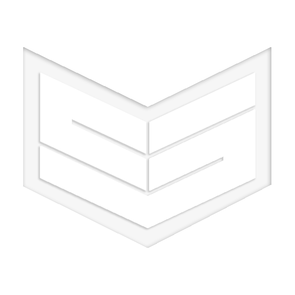
Our homie formerly known by rap name Blazē is rebranding himself and we're redesigning his logo. Blazē will now go by his full name Trē Redēau and we're currently brainstorming unique logo options. Click on the image below to sneak peak what we currently have.

Create Opportunity

"Always be prepared because you'll never know when an opportunity will come around." Wise words from my dad and I've appreciated the knowledge all my life. I attribute it to me constantly day dreaming and crafting new designs because you never know if your ideas will create new opportunities.

The Stars might be aligned for COMET

This past weekend I checked my spambox because often emails get lost in the spam filter and I fail to reply to emails whom needs immediate response. To my surprise I was hit with an email from a giant beauty/health appliance company inquiring about my design the "Comet" (click here to see comet)

As of right now I'm not sure what to expect, I'm curious as to what the conversation with this gentleman will be about & what it should lead to. Its really exciting and hopefully it'll lead into an opportunity to have this design produced.

To be continued...

Mt. Tabor Cross Fit

During my trip back home to Portland I accompanied a good friend to an 8am Cross Fit session after a long night of boozing. The place is called "Mt Tabor Cross Fit" the owner a extremely fit, fun, energetic women name Alex whom was friendly enough to offer up a class for me to try out that day. I gracefully declined and thanked her for her generosity but I was way too hung over to do anything extreme. Especially when it's been awhile since I've done anything physically strenuous.  


I had my canon with me so I offered to snap some photos as they work out. The 14mm fish was great for capturing the space and everyone in it. Told Alex i'd share the photos with her and hopefully the photos will be a good way to promote the gym. We talked a bit about my interest in photography and I told her my real interest was actually in design, the photo/video stuff was something I recently got into because it's been an effective tool to promote Creative Session.  Anyhow Alex mentioned there was an upcoming competition the gym was going to attend and have been in the market for a logo to represent the gym. I suggested for an events like this a graphic T would be more interesting and the benefit of this is that you can change it each year- yes, i offered up my services to take a stab at the design.


Here are the results of this years 2012 Mt.Tabor Cross Fit graphics. Unfortunately the project was a quick project therefore i did not document my process, hopefully the next time ill be able to show our process better.


Homeward bound San Francisco

So if you've been following a few months back we started a collection called "Homeward Bound" the concept was designing graphics inspired by the city each member of Creative Session grew up or lived in. We started em off with the Oregon sweater ( read about it here ) The design became quite a popular peice. We still have people asking about them now- unfortunately being a small company it's tough to do everything we'd like to get done so we had a small run of those sweaters. We're working hard at getting everything we design to people whom admire our design.

Well following the success of the "Oregon" design we'd like to introduce to the world the "San Francisco" addition to the family. LAX and NYC are coming up next.

A little reminder image here:

CS INTRO CLIP

I've been meaning to make sometime to design a 10 second branding video that we can use at the beginning of all our videos. Finally sat down and sketched a really simple idea. The concept is to capture our passion for sketching and how sketching can lead to design opportunity, hence the ding sound effect at the end. Let me know what you guys think.

Free Work Free Excercise

Sometimes doing free work allow you to be less self conscious about your design, let the ego down and have fun. [dropcap_2]My[/dropcap_2] long time friend Amy reached out to me the other day asking if I could design her 2012 softball team's jersey. They're called the "Banana Sluggers" and them fuggers are  a damn good team. So why not make it official with a well designed jersey.

Most years they get by with “Banana Sluggers” spelled in front a number on the back then names and sponsor carefully placed. They’ve never really had a logo so I thought maybe I should take a stab at it since it has become and annual thing for them. While Amy described the team my brain had already started crunching ideas.


The first thing that came to mind immediately was the peeled banana revealing a baseball bat! — I thought i’d run with that cause it’s honestly pretty clever. I wanted to add a silhouette of a softball behind the crossed bat but quickly realized it’s not going to be successful. The next thought was the baseball diamond and I think that is more successful.

Amy spoke a bit more about the team and the sponsors. Beaver Engraving and Suki Bar & Grill. My final thought was that we should keep the crossed bat with the baseball diamond as the base then add sponsors into the mix with each year as the sponsors change.

This year Beaver and Suki are added and this is result.


Keep in mind the design should be a two color print using vinyl. If there were no requirements I would want to add more detail to the beaver.